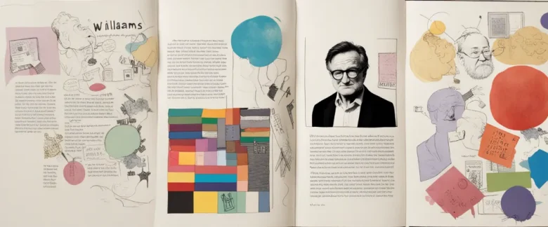

The Non-Designer’s Design Book, written by Robin Williams, is a comprehensive guide that aims to demystify the principles of design for those who are not professional designers. In this visually engaging book, Williams provides essential tips and techniques to create visually appealing designs. Throughout the chapters, readers will discover the fundamental principles of design, learn about typography, color, layout, and gain practical knowledge on how to apply these principles to their own projects. With her straightforward and approachable writing style, Robin Williams ensures that even non-designers can develop a deeper understanding of design and enhance their visual communication skills.
Chapter 1: Introduction to Design Principles
Chapter 1: Introduction to Design Principles in “The Non-Designer’s Design Book” by Robin Williams provides an accessible and comprehensive introduction to basic design principles for non-professionals. The chapter begins by emphasizing the importance of design in everyday life and highlights its impact on communication and engagement.
Williams introduces four fundamental design principles: proximity, alignment, repetition, and contrast. Proximity refers to grouping related elements together, making it easier for the viewer to understand the relationships between them. Alignment involves creating order and unity by visually connecting elements along a common edge or baseline. Repetition emphasizes consistency and reinforces the overall message by repeating colors, fonts, or shapes. Contrast, on the other hand, creates interest and highlights differences by using contrasting elements such as size, color, or shape.
The author provides practical examples and simple exercises to demonstrate each principle. By analyzing real-life designs, such as restaurant menus and brochures, readers can gain a deeper understanding of how these principles can improve the effectiveness of their own designs.
Additionally, Williams emphasizes the importance of choosing appropriate typefaces and fonts, discussing the differences between serif and sans-serif fonts and explaining how to pair them effectively. She stresses the significance of legibility and readability, considering factors such as font size, spacing, and line length for optimal comprehension.
Overall, this introductory chapter on design principles lays the foundation for non-designers to enhance their visual communication skills. It equips readers with basic principles and techniques to create visually appealing and effective designs. Williams’ accessible writing style and practical examples make the concepts easily understandable and applicable to a wide range of design projects.
Chapter 2: Working with Type
Chapter 2: Working with Type of “The Non-Designer’s Design Book” by Robin Williams delves into the fundamental aspects of typography and its effective implementation in design. Williams emphasizes that typography plays a crucial role in creating visually appealing and readable designs.
The chapter starts by explaining the four basic concepts of type: size, weight, style, and leading. Understanding these concepts helps designers make informed decisions about choosing and arranging type. Williams explains that size refers to the physical size of the letters, weight refers to the thickness of the typeface, and style encompasses variations such as italics, bold, or underlining. Leading, on the other hand, refers to the spacing between lines of type and can significantly affect readability.
The author then discusses the different classifications of typefaces: serif, sans serif, script, and decorative. Serif typefaces have small lines at the ends of the letters, while sans serif typefaces lack these lines. Script typefaces imitate handwritten styles, while decorative typefaces are whimsical or unique in appearance. Williams advises designers to choose typefaces that convey the appropriate mood and purpose of their design.
Furthermore, the chapter explores the concept of alignment, which refers to how text is arranged horizontally. Williams explains four types of alignment: left aligned (flush left), right aligned (flush right), centered, and justified. Each alignment has its own visual impact and can be used strategically to emphasize specific information or create balance within a design.
The concept of contrast is also covered, highlighting the importance of pairing typefaces that have contrasting characteristics. Contrasting typefaces can make text more readable and visually engaging.
Finally, Williams discusses the concept of white space, which refers to the empty areas surrounding text and other design elements. Utilizing white space effectively enhances readability and overall design aesthetics.
In summary, Chapter 2 of “The Non-Designer’s Design Book” provides a comprehensive insight into the foundational principles of typography, including size, weight, style, leading, alignment, contrast, and white space. Understanding and applying these principles can significantly improve the visual impact and readability of design projects.
Chapter 3: Understanding Color
Chapter 3 of “The Non-Designer’s Design Book” by Robin Williams focuses on understanding color and how it impacts design. The chapter explores the color wheel, color harmonies, and how to effectively use color in design projects.
Williams starts by introducing the color wheel, a circular representation of colors and their relationships. The primary colors—red, blue, and yellow—and the secondary colors—orange, green, and purple—are explained. The color wheel also highlights complementary colors, which are opposite each other on the wheel and create high contrast and visual interest when used together.
Next, Williams explains color harmonies, which are combinations of colors that are visually pleasing. Analogous colors, adjacent on the color wheel, create a sense of harmony and can be used to create a calm and cohesive design. Triadic colors, evenly spaced around the color wheel, create a more vibrant and dynamic effect. Williams also discusses warm and cool colors, explaining their psychological effects and how they can be used to convey different emotions or messages in design.
The chapter emphasizes the importance of contrast in design, as it allows for better legibility and visual impact. Williams explains how using light and dark values of a color, as well as utilizing contrasting colors, can help achieve an effective design.
Williams also provides practical tips for using color in design projects. She suggests limiting the number of colors used, using color strategically to guide the viewer’s eye, and considering the context and cultural associations of colors.
Overall, Chapter 3 of “The Non-Designer’s Design Book” provides a comprehensive introduction to color theory and how it can be used effectively in design. Whether it’s understanding the color wheel, exploring harmonies, or considering the impact of warm and cool colors, this chapter equips readers with the knowledge and tools to incorporate color successfully into their designs.
Chapter 4: Using Images and Graphics

Chapter 4 of “The Non-Designer’s Design Book” by Robin Williams focuses on the use of images and graphics in design. The chapter discusses the importance of using appropriate images and provides guidelines on how to effectively incorporate them into designs.
Williams emphasizes the significance of choosing images that support the message or theme of the design. By selecting images that are relevant and convey the intended meaning, designers can enhance their communication and create a visually appealing composition. The chapter stresses the importance of paying attention to the emotions that images evoke and highlighting the main focus through the use of contrast and emphasis.
Williams also explains concepts like resolution and file formats, which are essential for understanding image quality and compatibility. The chapter advises designers to use high-resolution images to maintain clarity, especially for print outputs. Additionally, the author provides useful tips on image sourcing, including the use of stock images and the importance of obtaining proper permissions and licenses for copyrighted content.
The chapter delves into the use of graphics and provides guidelines for creating simple and effective visuals. Williams emphasizes simplicity and consistency when using graphics, advising against complex or distracting elements that can detract from the design’s message. The book also discusses the use of color and contrast to create visual interest and ensure readability.
Overall, Chapter 4 is a valuable resource for designers seeking guidance on incorporating images and graphics into their work. It provides practical advice on selecting appropriate images, understanding image quality, and creating visually appealing compositions, ultimately enhancing the effectiveness of design projects.
Chapter 5: Layout and Composition
Chapter 5 of “The Non-Designer’s Design Book” by Robin Williams is titled “Layout and Composition.” In this chapter, Williams focuses on the fundamental principles of arranging elements on a page to create a visually appealing and effective design.
Williams starts by highlighting the importance of alignment, explaining that aligning objects creates cohesion and visual order. She introduces three types of alignment: flush left, flush right, and centered, and discusses how to use them effectively.
The author then delves into the concept of proximity, which refers to the placement of related elements close to each other to show their connection. She explains that grouping related elements using proximity helps readers identify relationships and understand the design more easily.
Next, Williams explores the concept of repetition, which involves using consistent elements throughout the design to establish a sense of unity. She discusses various ways to achieve repetition, such as using consistent typography, colors, and graphic elements.
The chapter also covers the importance of contrast in design. Williams explains that contrast helps emphasize important elements, create visual interest, and establish a hierarchy. She explains how to utilize contrast in terms of size, color, and style to make elements stand out.
Lastly, Williams introduces the concept of white space, emphasizing the significance of leaving empty areas in a design. She explains that white space can provide visual breathing room, enhance readability, and draw attention to key elements.
In summary, Chapter 5 of “The Non-Designer’s Design Book” explains how to effectively arrange elements on a page using principles such as alignment, proximity, repetition, contrast, and white space. By understanding and applying these principles, designers can create visually pleasing and functional layouts that effectively communicate their intended message.
Chapter 6: Designing for Print
Chapter 6: Designing for Print of The Non-Designer’s Design Book by Robin Williams delves into the fundamental principles and techniques of creating effective print designs. Williams emphasizes the significance of visual hierarchy and balance, in addition to providing guidance on typography and color choices.
Visual hierarchy is crucial in print design as it allows the audience to easily grasp and prioritize the content. Williams explains how designers can emphasize important elements by utilizing size, color, contrast, and positioning. By establishing a clear visual hierarchy, designers can guide the viewers’ attention and ensure they understand the message.
The chapter also emphasizes the importance of balance in print design. Williams introduces two types of balance: symmetrical and asymmetrical. Symmetrical balance involves arranging elements equally on both sides of a central axis, portraying a sense of stability and formality. On the other hand, asymmetrical balance is achieved by distributing elements of varying visual weight throughout the design, resulting in a more dynamic and visually interesting layout.
In terms of typography, Williams highlights the significance of selecting appropriate fonts and establishing visual consistency. She advises designers to limit the number of fonts used to avoid confusion and maintain a cohesive design. The chapter also discusses the importance of choosing readable and appropriate typefaces for the intended message, as well as applying effective spacing and alignment techniques.
Lastly, Williams explores the use of color in print design. She emphasizes the psychological impact of different colors and provides guidance on creating harmonious color combinations. This includes understanding color schemes such as monochromatic, complementary, and analogous, allowing designers to evoke specific emotions or moods in their designs.
Overall, Chapter 6 of The Non-Designer’s Design Book provides readers with a comprehensive understanding of the principles and techniques necessary for creating effective print designs. By learning how to establish visual hierarchy, balance, typography, and color choices, designers can create visually appealing and impactful print materials.
Chapter 7: Designing for the Web
Chapter 7 of “The Non-Designer’s Design Book” by Robin Williams, titled “Designing for the Web,” provides an overview of essential design principles and strategies specifically tailored for web design. In this chapter, Williams emphasizes the importance of understanding basic design principles such as proximity, alignment, repetition, and contrast, to ensure effective and aesthetically pleasing web design.
Williams starts by addressing the significance of proximity in web design. She advocates for grouping related elements closely together to create visual relationships, aiding in the formation of clear and organized web layouts. Alignment is another key principle discussed, highlighting the need to ensure that all page elements are visually connected and consistent throughout the design. Proper alignment enhances the readability and professionalism of a website.
Repetition is the next concept covered in the chapter, emphasizing the necessity of consistency in elements like fonts, colors, and graphic styles across different pages of a website. Consistent repetition establishes a sense of unity and helps users navigate effortlessly. Contrast is then introduced as a method of highlighting important elements and creating visual interest. By juxtaposing different sizes, colors, and fonts, designers can guide users’ attention and make content more engaging.
Williams also explains the importance of applying basic typography principles in web design. She advises designers to choose easily readable fonts, avoid using too many different typefaces, and ensure clear contrast between text and background. Consistency and simplicity are key principles in creating effective web typography.
Additionally, the chapter provides guidance on organizing content and creating effective navigation systems. Williams stresses the importance of considering the target audience’s needs and designing navigation menus that are intuitive and easy to use. She also offers practical tips for reducing clutter, using white spaces effectively, and optimizing images for web display.
Overall, this chapter serves as a comprehensive guide for designing visually appealing and user-friendly websites, focusing on fundamental design principles, typography, and navigation systems specifically for web design.

Chapter 8: Putting It All Together
Chapter 8 of “The Non-Designer’s Design Book” by Robin Williams is titled “Putting It All Together.” In this chapter, the author guides readers on how to apply the principles of design to create well-designed and visually appealing projects.
Williams begins by emphasizing the importance of consistency throughout a design project. Consistency in font choices, alignment, color scheme, and spacing helps create a sense of unity and professionalism. By using repetition and making deliberate choices, designers can ensure that their projects have a consistent visual language.
The author then discusses how to achieve visual hierarchy in a design. Visual hierarchy is crucial because it guides the viewer’s eye through the project, highlighting the most important elements and ensuring a clear message. Williams explains that designers can use size, color, contrast, and placement to establish a hierarchy and direct the viewer’s attention effectively.
Next, Williams introduces the concept of grouping and proximity. By placing related elements closer together, designers can create a connection and communicate their relationship to the viewer. Grouped elements form a visual unit and are easier to comprehend. Additionally, the author emphasizes the importance of white space or negative space, as it allows elements to breathe and creates a sense of balance and harmony in the design.
The chapter concludes by discussing the effective use of color. Williams explains the difference between additive and subtractive color models and provides guidelines for choosing a color scheme that conveys the desired message. By understanding color theory and considering the emotional response different colors evoke, designers can create impactful and visually appealing designs.
In summary, Chapter 8 of “The Non-Designer’s Design Book” explores the importance of consistency, visual hierarchy, grouping and proximity, and color selection in design. By applying these principles, designers can create professional and visually engaging projects that effectively communicate their intended message.
After Reading
In conclusion, Robin Williams’ “The Non-Designer’s Design Book” provides an accessible and comprehensive introduction to the principles of effective design for non-professionals. Through clear explanations and practical examples, Williams demystifies design concepts such as proximity, alignment, repetition, and contrast, empowering readers to create visually appealing and impactful designs. From typography to color theory, this book equips individuals with the essential skills to communicate their ideas in a visually compelling manner. “The Non-Designer’s Design Book” is an invaluable resource for anyone seeking to enhance their understanding of design principles and elevate the quality of their visual communication.
1. “Thinking with Type” by Ellen Lupton – Just like “The Non-Designer’s Design Book,” this book explores the fundamentals of graphic design, specifically focusing on typography. It offers practical advice, examples, and exercises to help readers understand how to effectively use type in their designs.
2. “The Elements of User Experience” by Jesse James Garrett – This book delves into the world of user experience design, providing a holistic approach to creating successful digital products. It covers all aspects of the design process, from strategy and content to interaction and visual design, making it a valuable resource for designers looking to create user-centered experiences.
3. “Don’t Make Me Think” by Steve Krug – Similar to “The Non-Designer’s Design Book,” this book emphasizes the importance of simplicity and usability in design. Krug explores the concept of intuitive design and provides practical tips to improve website and interface usability, making it an essential read for designers and anyone involved in creating user-friendly digital products.
4. “Universal Principles of Design” by William Lidwell, Kritina Holden, and Jill Butler – This comprehensive guide provides an overview of 125 design principles that can be applied to various design disciplines. From color theory to gestalt principles, it offers valuable insights into the fundamental aspects of design, enabling readers to make informed decisions and create visually appealing designs.
5. “Designing Brand Identity” by Alina Wheeler – This book focuses on the crucial aspects of branding and how design plays a vital role in shaping and maintaining a brand’s identity. It covers topics such as brand strategy, naming, logo design, and more. With real-world case studies and practical advice, this book is a great resource for designers and marketers looking to create impactful and memorable brands.